
The new Your Products
Create, edit and monitor - manage all of your products in one place.
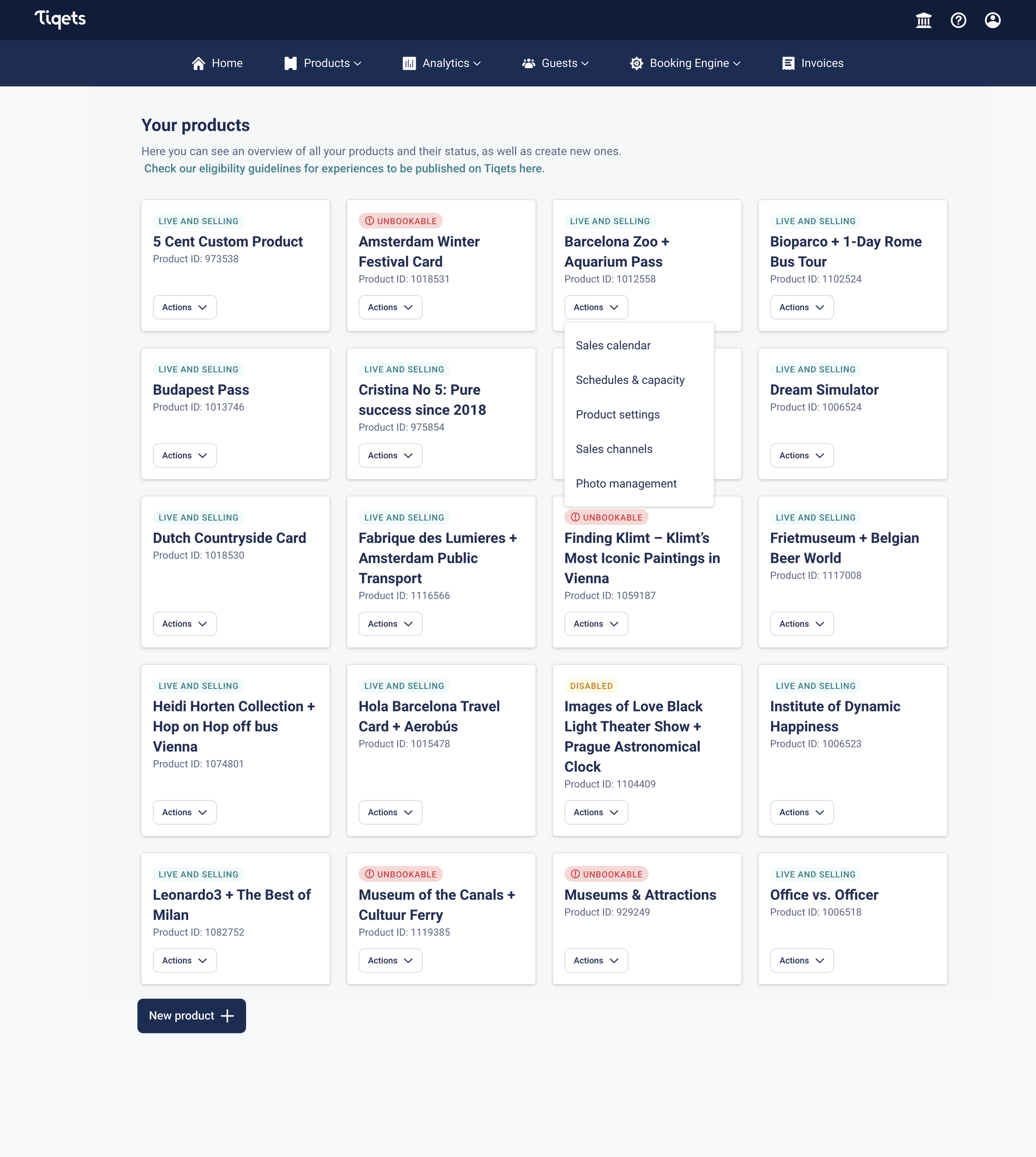
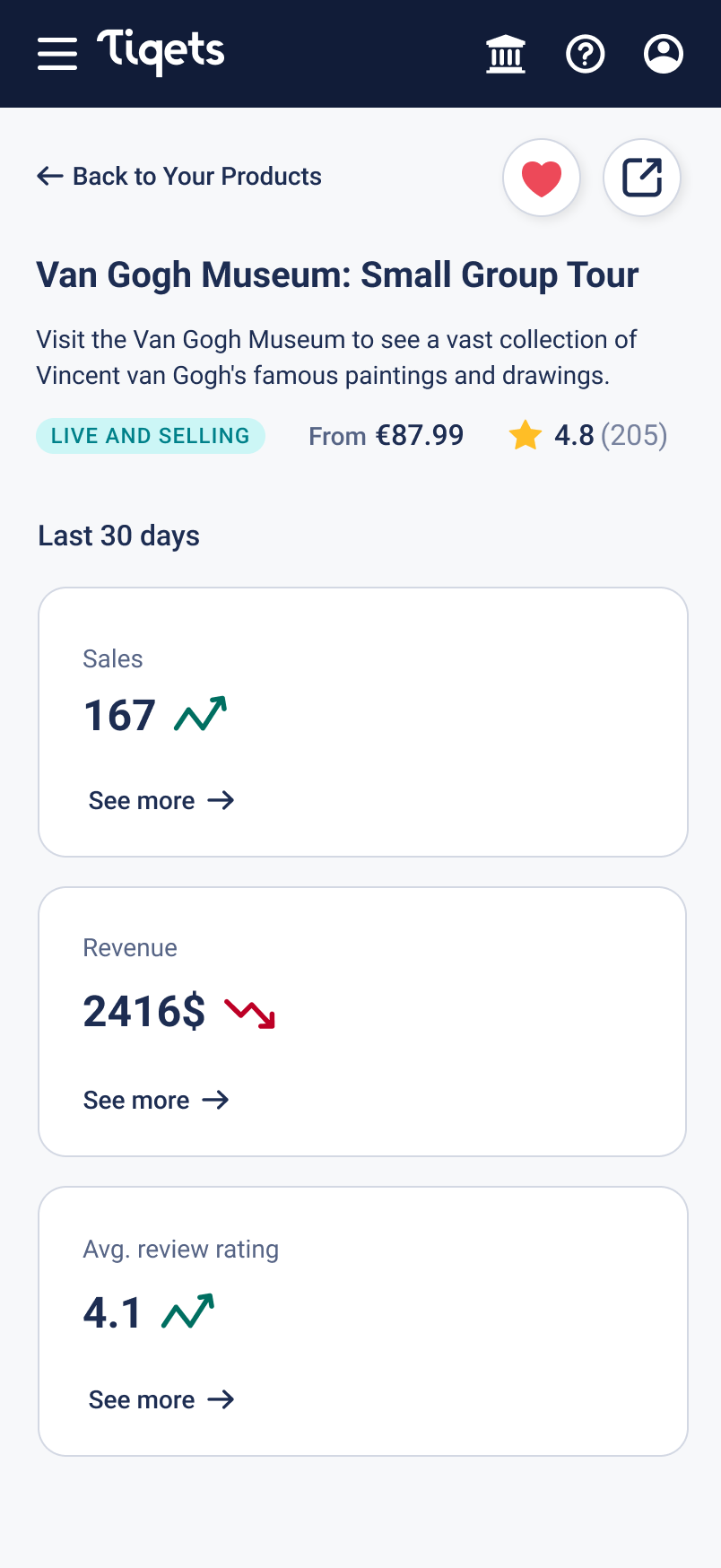
Before

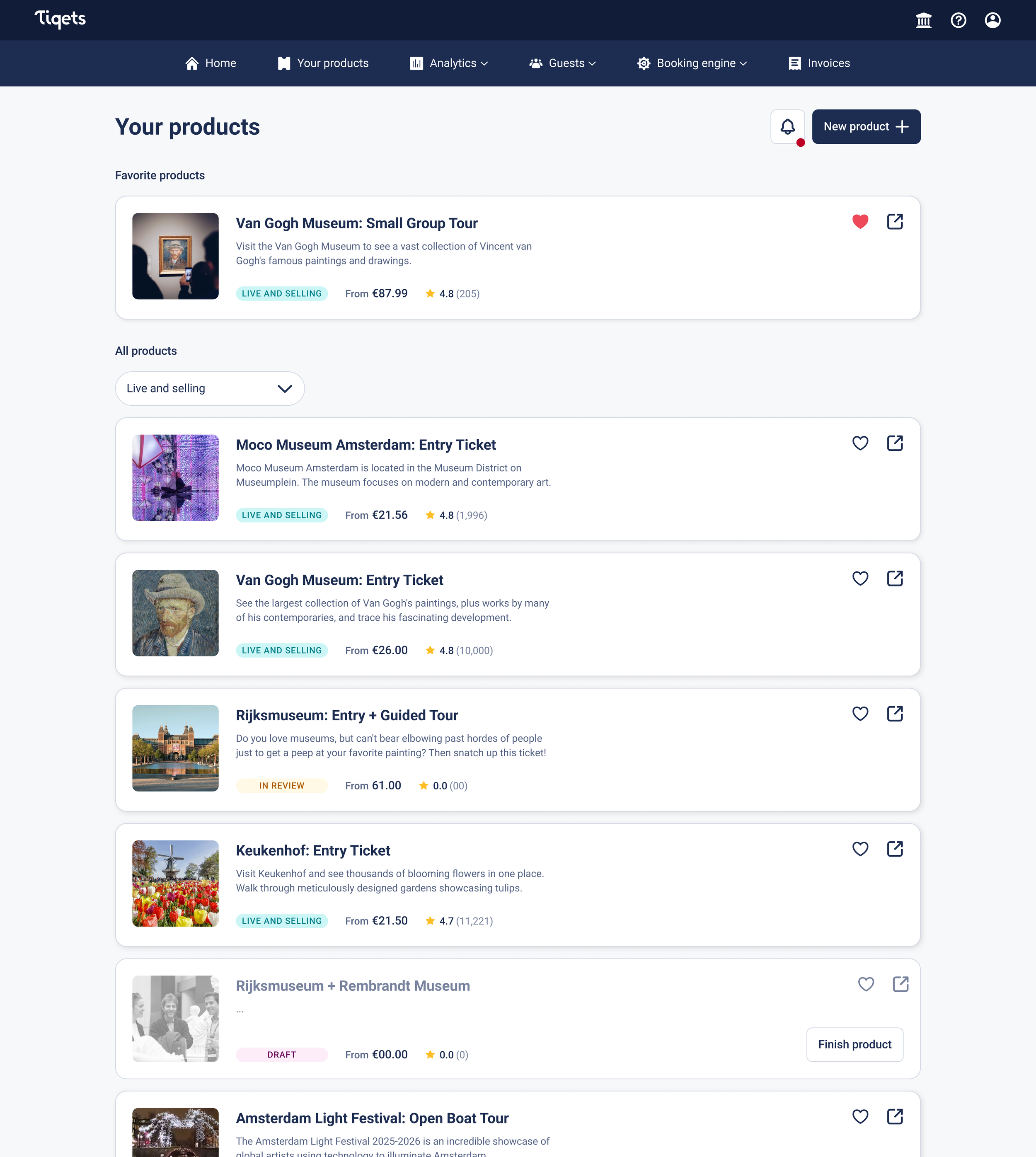
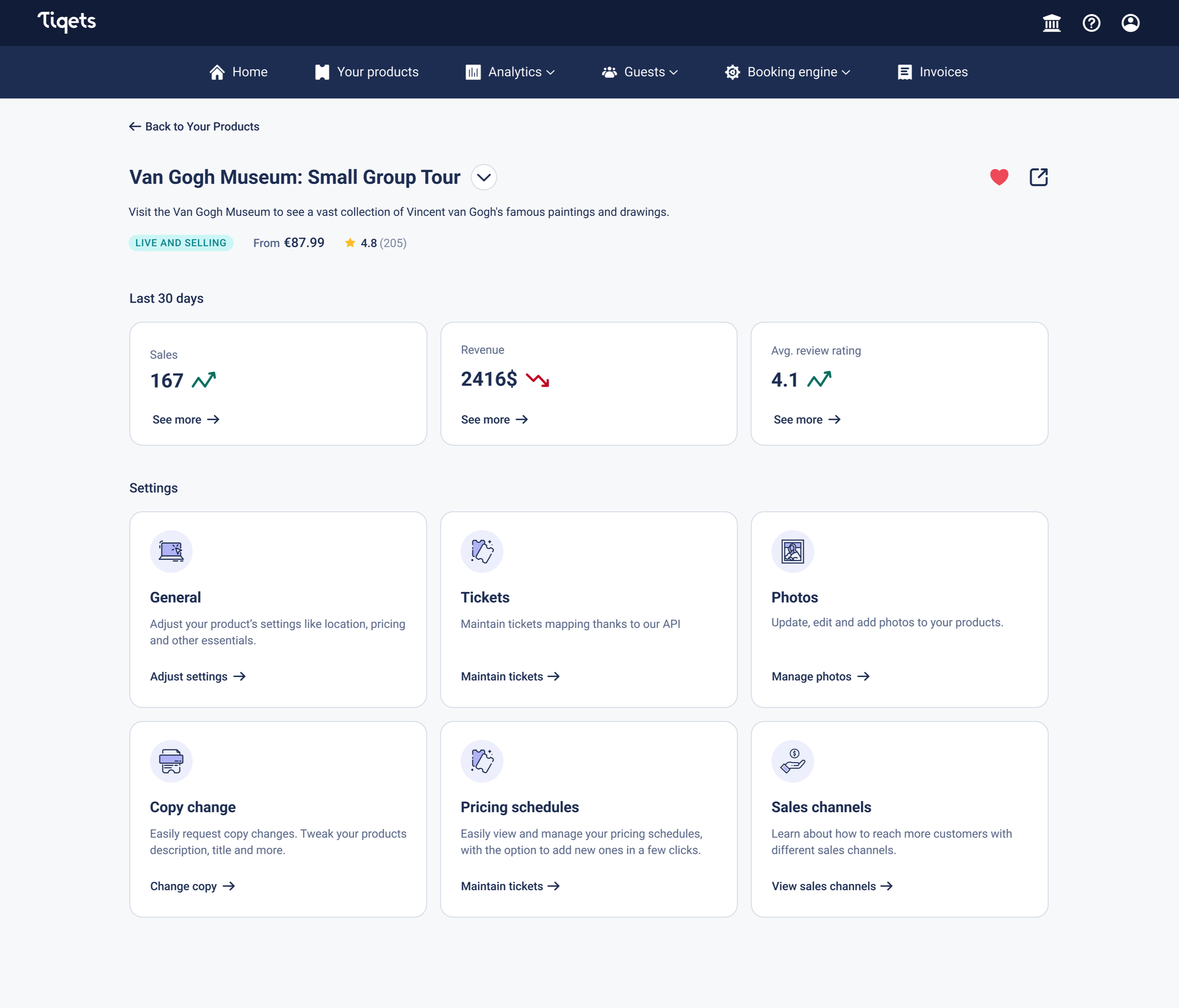
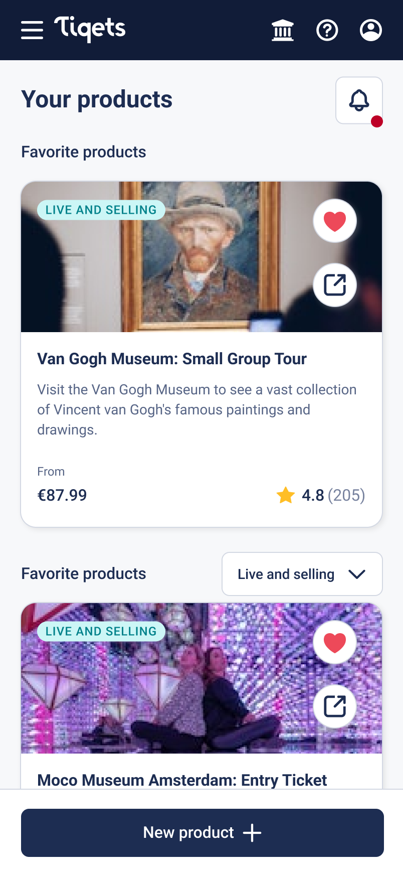
After
Let’s start from the beginning
Context
“Your Products” is considered the primary page of the Supplier Portal. The goal of it is to allow users to oversee, create and manage their products in one place.
Currently, the page is the second most-used page in the Supplier Portal by page views after login and third by interactions.
Symptoms to change
The page has the highest amount of “Request Help” out of any Supplier Portal page by a high margin.
Most importantly, friction with product maintenance was mentioned as the main user problem according to the 2025 Supplier Satisfaction Survey (a study conducted on 196 suppliers).
Beyond the user perspective, the current page structure is not scalable. Adding new features in recent months has made both design and implementation harder, while also increasing visual clutter and worsening the page’s hierarchy and actionability.
Strategic fit
Following the current company strategy on procuring more bulk-uploaded products, we decided that maintenance of existing products and making it easier to use for our users is equally important.
Also, the future merger of Expedia’s Supplier Portal with Tiqet’s one made it clear that the current implementation has to be improved to accommodate Expedia’s product stock.
Road to the hypothesis
1. Collaboration from the start
To kick-start the work I organised a brainstorming workshop with my product team, data scientist and a UX writer. The goal was to put ourselves in the user’s shoes. Map out potential user problems, surface our assumptions and blind spots and if there is time - come up with some solutions.
Key themes from the workshop:
Reduce Decision Fatigue
The current product management flow feels fragmented, overwhelming and unclear. Suppliers experience friction and are struggling to find and understand the necessary settings needed for efficient product management
Make Products Easier to Find
Finding products becomes difficult, especially for suppliers with many products. The current experience lacks strong search, filtering, and sorting.
More information at a glance
Suppliers currently lack quick visibility into important product and business information. A lot of it is missing. Suppliers are unable to make informed decisions or find relevant products without searching for information across the whole portal.
2. Asking at the source
The brainstorming workshop gave us direction and allowed us to start the work - but also showed how significantly we’re relying on assumptions. We knew that Your Products has major usability issues based on our expertise and symptomatic data, but we lacked the concrete insights straight from the users - that’s why we decided to run a usability testing of the current solution.
Interestingly, 5 usability tests showed that our assumptions were pretty accurate and mostly aligned with what the users said.
Key insights from the users
Accessing settings is cumbersome
“I feel like I have to dance around the whole Supplier Portal to find the setting I want - it always feels like a challenge”
Product cards need more information
“I have a sticky note of the prices of our major products of my monitor (…); product descriptions would also be nice”
Product statuses are overwhelming
“There are like a million statuses and random banners popping up without any context…”
3. User’s perspective in a nutshell
Needs
I need to easily manage and tweak my product, without stressing over how and where to do it
I want to change my product’s settings and see all its functionalities in one place.
I need a clear and reliable way to understand my product's status so I can feel confident it is selling and operating correctly.
I need to be able to quickly find and identify the product I’m interested in.
Goals
I want to efficiently monitor my product’s performance and be notified about any issues and resolve them with minimal effort.
I want to see all necessary information about my products at a glance, without diving into different pages or being forced to remember important details.
Problems
The products have many pages with settings and features that are confusing to find and hard to understand
Multiple banners, status pills and error messages make it too hard for me to understand what’s going on with my product and how to solve it
The product cards don’t show enough relevant information to fully understand what product I’m looking at
4. Last stop (for now)
Suppliers using the Your Products page face challenges in managing, creating and monitoring their products due to the confusing UI, information overload and friction in finding desired settings. The current design leads to frustration and inefficiencies, preventing suppliers from effectively utilising the page to its full potential.
— Problem statement
We believe that by redesigning the Your Products page, suppliers will be able to manage and monitor products more efficiently and intuitively. This will lead to a reduced drop-off rate when accessing settings, an increased product creation ratio and reduced “Help” requests.
— Hypothesis
The right solution
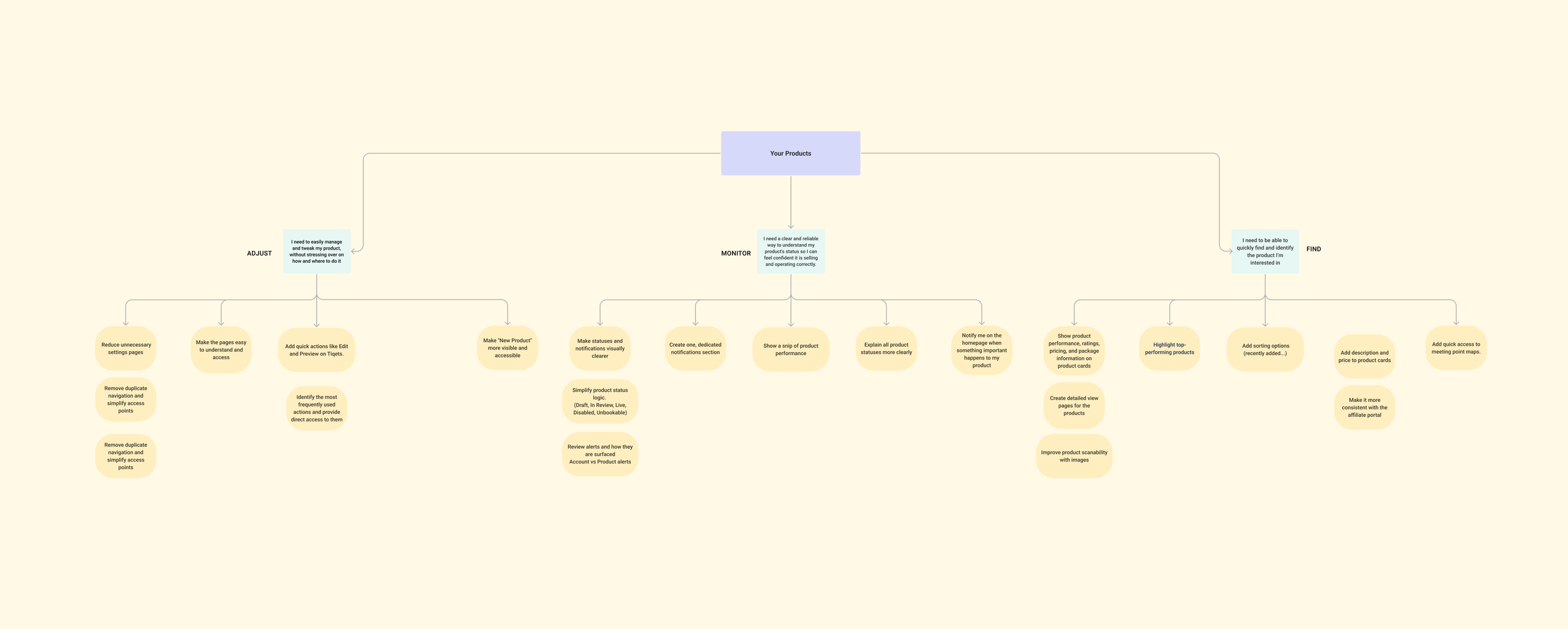
1. Mapping all the options
To make the possible improvements transparent and easy to follow, we decided to map them out. That helped us to understand the scope of work that has to be done to fulfil the user needs.
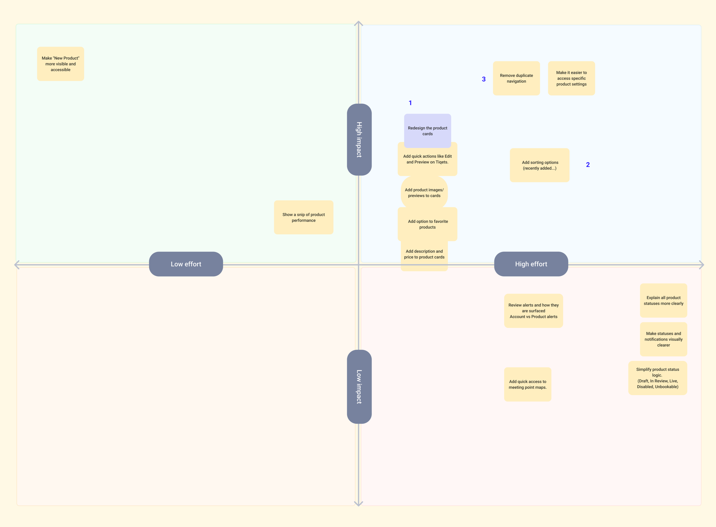
2. Strategic prioritisation
Your Products require a ton of work. To make sure that we can make an impact as quickly as possible, we strategically prioritised and scoped the necessary work.
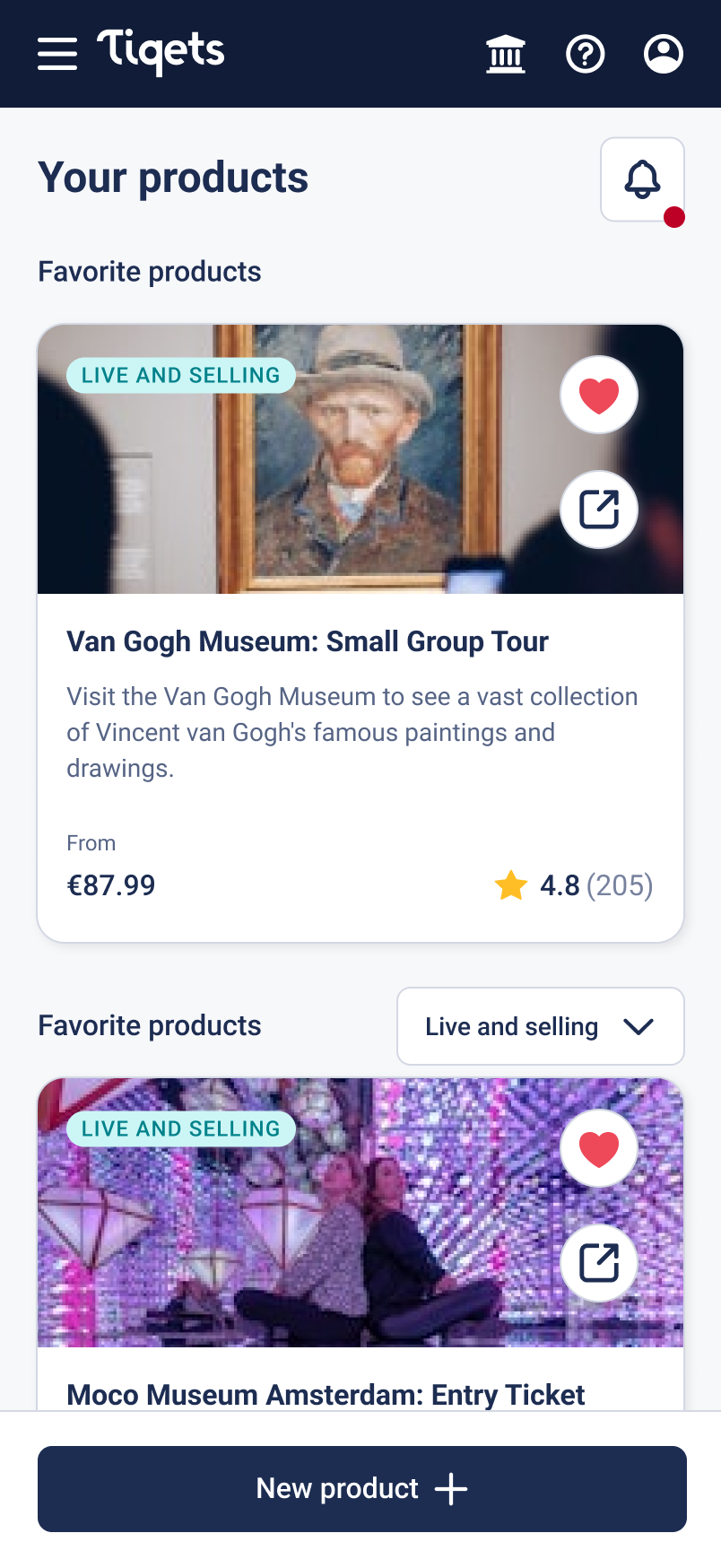
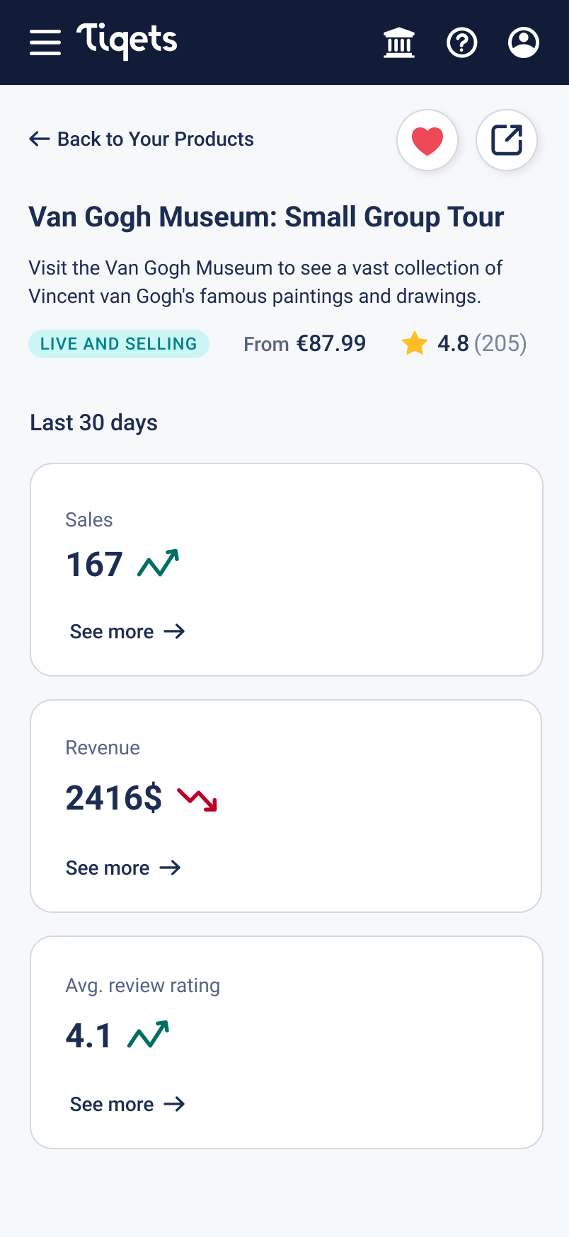
3. Design (one more look)
4. Impact (after 30 days)
21%
reduction in drop-off when accessing settings
28%
fewer help requests related to Your Products
7%
increase in products created